I “KISS”ed an app and I liked it!
Ironhack Wellness Project Part 2/2 — UI Design

Clear your mind for a minute. Think of nothing. Imagine yourself in a big wide emptiness. It’s white everywhere. Feel the air that blow into your face. It’s relaxing, isn’t it? And then see the thin line far, far away on the horizon. Slowly approach to that. On your way there, the horizon starts to become colorful. Bright, poppy colors. Red, orange, teal, green, blue, yellow, violet. Isn’t this such a great surprise! It makes you feel happy. And you smile. Put on your biggest smile now and come back to reality.
Welcome back!
You were on my inspiration journey of my Appy app mood board. These will be the emotions I want to convey to my users via my user interface. In this story I will tell you more about the UI design process of this project.

UX Design, Briefly…
I had started this project as a UX design challenge. You may read my story on UX design here. But let me briefly explain it to you:

My persona is Charlotte, the mood swinger. She is 28, a Marketing Specialist looking for a promotion since 4 years now. No matter how hard she tries she can’t show she’s successful at work. Throughout a regular work day she has too many ups and downs in her mood and this disturbs her. She cannot focus on good things in her life.
So my primary UX problem was: How might we train our brains to become more happy?
The solution I came up with was Appy: An app that allows its users to interact with a closed group of friends on an infinite horizontal timeline, by logging in pictures, texts, emojis and locations throughout the day. It’s also a happy memory reminder; when the user logs in a sad emoji, the app would remind her a happy picture. This was my MVP.

UI Design, The KISS…
Before anything else, I translated my latest (tested and approved) low fidelity wireframe into mid fidelity Sketch wireframe. As you can see in the images below, I tried to keep everything simple and stupid (KISS). The main screen is composed of only horizontal timelines, log bubbles (for pictures, texts, emojis and location sharing) and the menu button as a plus sign.
From low to mid fidelity, I made small changes in the design only because some elements were interfering with each other. Such clutters are more visible when grids are present and mid fidelity wireframe is the perfect place to change such small details. For example, on the onboarding screens the pagination symbols were on the bottom of the screen but since it was hiding the menu button, I put them at the top.

I also decided to create a special emoji keyboard during mid fidelity design. Since my app would remind memories when the user types in a negative emoji, this feature would be better managed this way. The keyboard is composed of 15 emojis, with 7 negative, 7 positive emotions and 1 ‘Zzz’ for sleep. :)
Visual Benchmark
While forming my mood board that I introduced you in the very beginning, I simultaneously did a benchmark to analyze competitors’ visuals.

They mostly used very serious visuals overall their app which is actually understandable because most of them were developed based on serious researches about happiness.
This time I also included Path and cluster.co in my analysis. Although they are social media networks and cannot be considered as a direct competitor for a happiness application, they had similar features to Appy. That’s why I considered to analyze them visually.
I concluded that unlike my competitors, I wanted to have a colorful, cool and fun interface with lots of breathing white space.
Appy, in colors…

My style tile is composed of 9 main colors. For texts, I wanted to use these colors as well but they didn’t pass the contrast ratio test, that’s why I used dark grey for all texts in the app.
I included basic geometric shapes on my style tile out of which I first created a pattern (you can see just below the color circles) and then had the idea to use these shapes on the timelines, where each shape would represent a specific log.
For typography, I chose to use a sans serif font with thin strokes; Raleway. Another reason for this typography was the fun and joyful movement of its number characters. I will use a lot of numbers to state the timing on the timeline and Raleway would give them a joyful personality.

Building the UI elements…
To start designing the tiniest elements until constructing the main structures of the app was the main challenging part for me. For two reasons; first was to create a clean icon family was not easy, and the second one was because I had to take some main design decisions.
The main decision was: diamonds! (and sparkles!) Remember I had the ‘like’ feature for pictures. The picture that had more likes were appearing more often as reminders. However one incident during my user tests made me think of this feature more in detail. A tester didn’t feel very comfortable liking a picture of herself while uploading it to her timeline; it made her feel arrogant. I explained her that it wasn’t about liking the picture itself but it was about the memory. But when I thought about it later, actually the main idea was that our memories are very precious to us. The happiest ones are the most precious ones. So we are not ‘liking’ them in this sense, but we are claiming that they are ‘precious’. That’s how I came up with the diamond shape and sparkles instead of conventional hearts.


Appy, in full shape!
Herebelow, you can play with the high fidelity wireframe. (or watch an already played version here)
Some instructions before you start. First you will follow the onboarding screens where you will learn more about how to interact in the app. And then I have 3 user flows you can test, which are:
- Take a picture and upload to timeline.
- Interact with Lucie, she seems sad. Send her a kiss emoji.
- Upload a sad emoji to your timeline and see what happens.
Enjoy! :)
User Testing

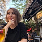
I tested my high fidelity wireframe with some users. (Oh and here is the perfect time to thank to lovely testers at Starbucks Faubourg Saint-Honore, Paris who were kind enough to spare some time to me while sipping their coffees…) The tests turned out to be great as I had all positive emotions for my UI. They claimed the interface was motivating, organized, friendly, innovative, easy-to-use and clean. Besides motivating and easy-to-use, these were the emotions that I was looking for.
There was also one more positive emotion that I wanted to convey but couldn’t make it; satisfying. But I thought this could be dealt with the micro interactions that will be built. I started making some of it as you can see below. I made an empty state page where I made the animations on Anima. I also put micro interactions on the on boarding screens on Flinto.


Final thoughts…
I really enjoyed all of the UX and UI processes of this app. I was very motivated to hear positive feedbacks about the app, which made me believe more in my project and also kind of made me want to develop it for real! I will hold this thought until the end of the bootcamp (because next 2 weeks are final project weeks, yay!) and then see what I can do about it. In the meantime if you have any feedback about this project I would be very ‘Appy’ to hear them!
Thanks for reading my story!
You can read the first part (UX Design) of my story here.